

A few simple rules keep Melonly recognizable wherever it appears. Use the original artwork, give it space, and let its colors speak for themselves.
Our logo
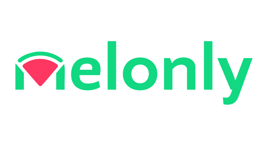
Use the full wordmark whenever possible. The alternate colorway is available when coral text fits better; use the symbol alone only when Melonly is already clear from context.

Clear space
Use the pink diamond inside our mark to measure clear space. Leave at least one diamond height between the logo and any text, image, or edge.
Do & don’t
Keep the artwork intact. These examples show the simplest ways to get it right and the changes that make it feel less like Melonly.
Keep its proportions
Give it space
 COMMUNITY
Use the right colors
Color
Mint and coral belong to the identity. Teal is used for actions in the product, with dark surfaces behind them.
Typography
Open Sans is used for interface and long-form text. Use clear headings and comfortable line spacing so the message stays easy to read.
Brand assets
Choose PNG or SVG for each asset. Keep their proportions and colors intact; use a product mark only when referring to that product. SVGs made from PNG artwork preserve the original pixels.